Turn off Apple Wallet / Apple Pay notifications and nag screens

The latest version of IOS for iPhone, iPad, and iWatch devices really, really wants you to set up Apple Wallet / Apple Pay. Your devices want you to embed Apple in the middle of every purchase, and they’ll pester you every time you pick up your device with full-screen dialogs insisting that you need to finish setting up Apple Wallet. Right. Now.

I try to limit the number of things that can access my money, and I have no reason or desire to set up Apple Wallet, so I turned the notifications off. They are embedded in three separate places on the iPhone.

Go to Settings > Notifications > Wallet, turn Allow Notifications off.

Go to Settings > Wallet & Apple Pay, turn both the Apple Cash and Double-Click Home Button off.

Go to Settings > Safari, scroll to the bottom, click Advanced, turn Check for Apple Pay off.

After you update the three settings above, you will still see a notice in Settings stating Finish Setting Up Your iPhone.

    • Click Finish Setting Up Your iPhone.
    • It’ll prompt you to Set Up Apple Pay.
    • Click Set Up Apple Pay, then press Cancel or "Set up later" to exit without doing anything.

No more nag screens!

Hope you found this useful.

Article updated on 2018-07-10 and 2019-10-08 for IOS 13.1.2
Article checked on 2020-06-15 for IOS 13.5.1. The instructions still work!
Article checked on 2020-11-27 for IOS 14.2.1. The instructions still work!
 
Article checked on 2022-03-15 for IOS 15.4. The instructions still work! 
Article checked on 2022-10-18 for IOS 16.0.3. The instructions still work!
Article checked on 2023-10-08 for IOS 17.0.3. Made two minor changes to the instructions, and they still work!

5 User Engagement Problems Twitter Should Fix this Week

Twitter’s mobile app needs help.

Of all of the social networks, engagement on Twitter is dismally low. Even the people who like the app don’t spend nearly as much time on Twitter as they do on other social media. There are some obvious problems with the app that Twitter could fix, but they don’t.

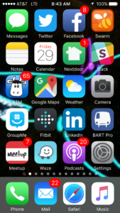
iPhone with badged icons

Which one will you click?

Until a few months ago, Twitter’s iPhone app didn’t support badge notifications. A badge is the small red number that appears on the app’s icon letting you know that you have Notifications. Twitter’s iPhone app didn’t have them. You could look at your phone’s screen and see that Facebook, LinkedIn, MeetUp, and NextDoor had messages waiting for you, but not Twitter. A glance at your screen and the small red numbers taunt you – Check FaceBook! Check your email! Check Messages! Badges are a simple way to get you to start up that app and engage.

1. Fix Notifications

With a recent update, Twitter finally added badge notifications. Only problem is, they don’t actually work. The badge will appear with a “2” on it, I’ll start the Twitter app, and the “Notifications” icon indicates that there’s something new. I click it, and there are no updates. I can check the “Me” link and see that I have 2 more followers, but they’re not listed on the Notifications screen. If I log into the TweetDeck web app I can see who the new followers are, but the iPhone mobile app pretends they don’t exist.

2. Make it easy to engage with friends

Ever have a conversation with a friend on Twitter? It’s next to impossible to follow replies, comments, or have any sort of conversation using the tools they provide on their mobile app. If Twitter wants to increase user engagement, they should get rid of the Messages tab and make it a “Mentions” tab that shows private messages and allows for threaded conversations. Alternately they could add a “swipe left” feature or even a “view replies” icon to view the replies to a message, in threaded order. Make it possible for people to have a conversation about the things that they’re posting, and they’ll stay on engaged for longer.

3. Show me what posts are trending

The Home button shows me the latest messages from everyone I’m following in order by time posted. What if I want to see the posts with the most retweets? Or the most hearts? Or the most replies? You know, the messages from the people I’m following that are the most interesting/funny/relevant? Get rid of the “Moments” section and give me a “Trending” section that shows the items from the people I follow with the most retweets, likes, and replies. I guarantee I’ll spend more time in that section than I do looking at “Moments”.

4. Load more items in the “Home” feed

I use an iPhone with “service” from AT&T. I also ride BART, which means that I spend about half my commute with no data service. (Newsflash to AT&T: People on trains spend most of their time on their phones. If you cared about your customers you’d send a tech to ride a train with a signal strength meter a couple of times a year and fix the dead zones.)

Since mobile data service is spotty, you’d think the Twitter app would start downloading items for my “Home” feed as whenever I have a signal, so I’d never run out of items to read. Unfortunately that’s not the case, and I routinely hit the end of the list of things on “Home” to read just as BART enters another AT&T dead zone. I sit there watching the spinner for a few seconds, then quit Twitter and load another app – one that was smart enough to download content in the background so it’s ready for me to view.

5. Cache some damn profile pictures

I only follow 361 people on Twitter. Each one of them has a small profile picture that rarely gets updated, so why does Twitter download and render a the same, identical profile photos every time I open the app? I’ll be scrolling along, and I can see it download and render the photos one by one. If I’m in an AT&T dead zone, I’ll just see a bunch of empty boxes instead of profile pictures in my feed. How hard could it be to cache a copy of the photos on my phone? The app can always check for new photos and update them if one is available, so why is it downloading them every time I open the app? If I don’t have a connection at the moment it’s OK to show me someone’s 24-hour-old profile picture – it’s better than showing me an empty box.

That’s it. 5 simple things that Twitter engineers could fix this week to increase the amount of time people spend using their mobile app.


Full disclosure: I own shares of Twitter stock. If someone at Twitter fixed these problems I might be making less of of a loss on those shares. In addition, the Twitter stockholders meeting is this week. I won’t be there, but if you are feel free to share this article with the people in attendance.

How to turn off AMBER alerts on an iPhone

Last night I was woken up by an AMBER alert on my iPhone. Apparently there was a horrific murder and possible child abduction and the police wanted to make absolutely sure that every cell phone -carrying person in the state was made aware of the fact, just in case we spotted the children somewhere.

I live near San Francisco. The possible abduction happened near San Diego. It’s an 8 hour drive away. Teleportation has not been invented yet. There is no possible way that I am going to have witnessed anything that can help.

Until the people operating the AMBER alert system either:

  1. Limit notifications to the geographic area where they might actually do some good
  2. OR Give me the option to disable AMBER alerts while I’m asleep (“Do Not Disturb” mode is enabled)
  3. OR Give me the option to disable AMBER alerts while stationary (phone is not moving, so I’m not out and about and therefore unlikely to witness anything helpful)

… I am going to disable AMBER alerts on my iPhone. If one of these problems is addressed I’ll consider turning alerts back on. Until then, they’re staying off.

If you feel the same way, here’s what you do:

  • Go to Settings -> Notifications
  • Scroll all the way down to the bottom of the screen
  • Switch “AMBER Alerts” to the OFF position
  • Get some (undisturbed) sleep

How to Improve the AMBER Alert System so that it’s MORE Effective

I am convinced that the AMBER alert system can do good, but I also believe that it will be less and less effective if the people managing the system continue to send out alerts in such a ham-handed way. If the people managing the system send alerts to mobile phones in the middle of the night, and the only options that a mobile phone user has are ON and OFF, more and more people will start turning AMBER alerts OFF, making the AMBER alert system less and less effective.

I’ve built many operations alert systems over the past 15 years.  Sending repeated alarms to the wrong people makes those people ignore alarms. Sending alerts all of the time desensitizes people when there’s an actual alarm they should worry about. If I had a little more control over how and where I receive AMBER alerts, I’d leave them on. Here are my suggestions to the maintainers of the AMBER alert system:

Limit alerts to phones within a given radius of the scene of the crime. Every cell tower has a known geographic position. Every active mobile phone self-registers with the nearest cell tower. With the incident that took place in Boulevard, CA (near San Diego), alerts went out to all of California, alerting citizens in Yreka, CA (851 miles from the crime scene), but not Fortuna, AZ (123 miles from the crime scene).  By sending alerts to cell towers within a 200 or 300 mile radius, the alerts would be seen by the people most likely to have actually seen something. Sending alerts to people 850 miles from the crime scene desensitizes them to future alerts.

Include a URL for more information. If you’re sending the alerts to smart phones, include a link that someone can click for more information, then they might actually know what to look for.

Delay alerts for phones that are in “Do Not Disturb” mode. No one wants to be woken up at 3am with a screeching alert tone only to find out that they need to be on the lookout for a blue Nissan pickup truck. There are no blue Nissan pickup trucks in my bedroom or anyone else’s bedroom. If a phone’s “Do Not Disturb” mode is turned on, hold the alert until the DnD time is over, then alert the person carrying the phone. That’s one less person who will turn alerts off.

Better yet, hold alerts until the phone moves. If a phone’s “Do Not Disturb” mode is turned on, hold the alert until the DnD time is over, then alert the person carrying the phone as soon as they pick it up or move the phone. I’m awake now, you have my full attention, and I’m getting ready to go somewhere where I might actually see something. That’s the time to tell someone to be on the lookout, not at 3am when they’re asleep.

With these simple changes the AMBER alert system could be made more effective, reaching people who might have seen something at the time when they’re actually out and about. Without changes such as these, the system will become less and less effective over time, and lives will be lost.

Fix the system. Make it better. Make it more effective.

If you find this useful, please click the “share” button and share it with your friends.